iOS: Slider
A slider is characterized as a UIControl that presents the user with a continuous range of values on a single scale, from which they are asked to choose one. The thumb is meant to be moved on the slider by the user. The action method, which receives a notification each time the user drags the thumb onto a slider, is linked to the slider. Every time the action method is invoked, it is possible to access the slider’s value.
This is how the slider is declared.
class UISlider : UIControl
Example
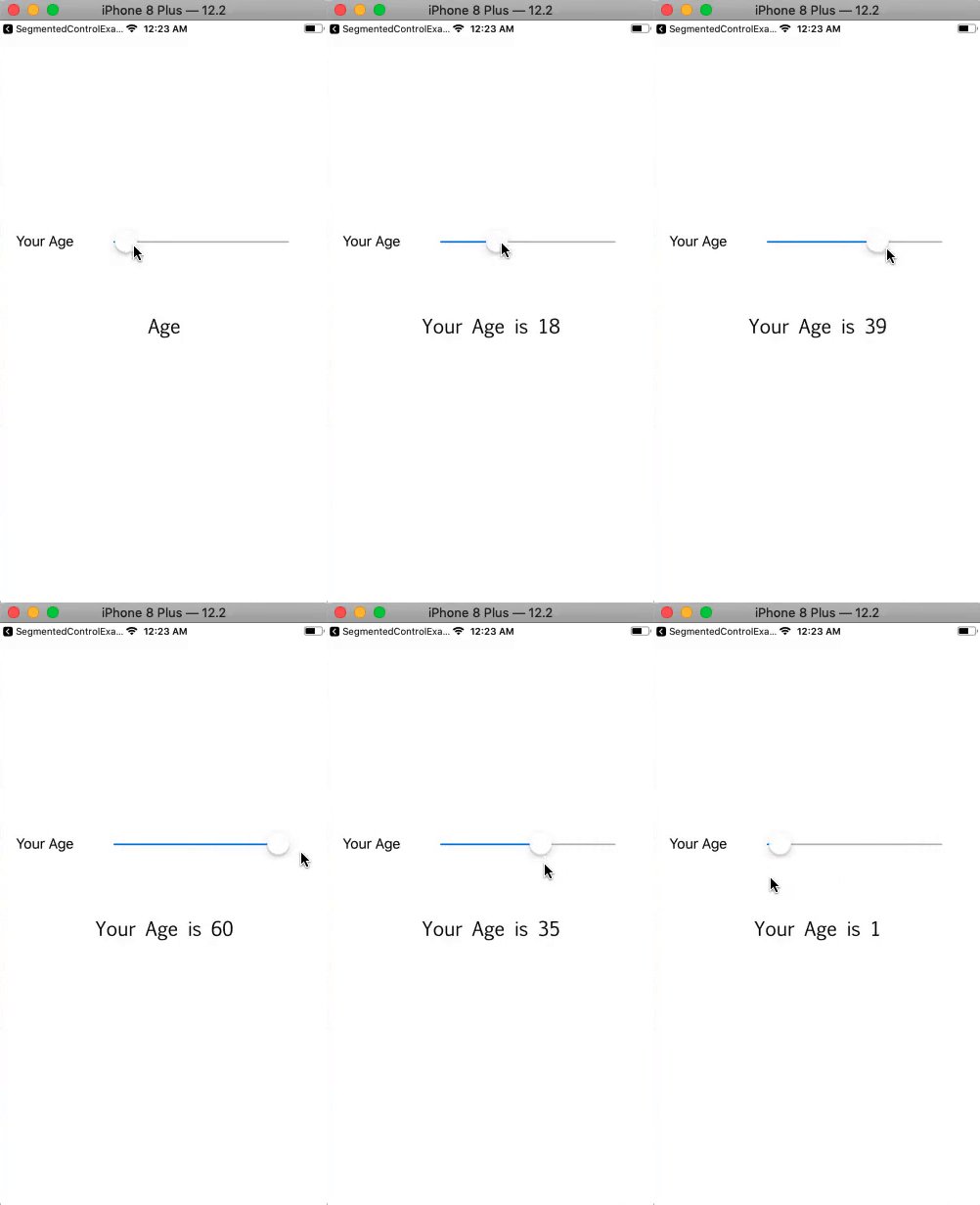
In this example, we’ll give the user a slider to choose his age by allowing him to click on various values.
Interface Builder
For this example, we have made a very basic storyboard. To display the slider’s current value, we have used a slider and a label. The interface builder (storyboard) that was made for the project is displayed in the picture below. The action method, which is linked to the slider, is utilized to set the message label text based on the slider’s current value.

ViewController.swift
					import UIKit
class ViewController: UIViewController {
    @IBOutlet weak var mySlider: UISlider!
    @IBOutlet weak var ageMsgLbl: UILabel!
    override func viewDidLoad() {
        super.viewDidLoad()
        // Do any additional setup after loading the view.
        mySlider.minimumValue = 0
        mySlider.maximumValue = 60
    }

    @IBAction func sliderValueChanged(_ sender: UISlider) {
        let roundedValue = round(sender.value)
        sender.value = roundedValue
        ageMsgLbl.text = "Your Age is "+Int(sender.value).description
    }

}
Output

Core Attributes
| SN | Attribute | Description |
|---|---|---|
| 1 | Value (minimum/ maximum) | It represents the float value, which is specified at the ends of the slider. The minimum value represents then leading end of the slider whereas the maximum represents then trailing end of the slider. |
| 2 | Value (current) | It represents the initial value of the slider, which is changed when the user interacts with the slider. It exists between the minimum and maximum values. This can be accessed at runtime by using value property on the slider object. |
Appearance attributes
| SN | Attribute | Description |
|---|---|---|
| 1 | Min Image | It represents the image specifies the leading end of the slider. This can be accessed by using minimumValueImage property at runtime. |
| 2 | Max Image | It represents the image specifies the trailing end of the slider. This can be accessed by using the maximumValueImage property at runtime. |
| 3 | Min Track Tint | It is the track tint color of the leading side of the slider. This can be accessed by using minimumTrackTintColor property at runtime. |
| 4 | Max Track Tint | It is the track tint color of the trailing side of the slider. This can be accessed by using the maximumTrackTintColor property at runtime. |
| 5 | Thumb Tint | It is the tint color of the slider’s thumb. This can be accessed by using the thumbTintColor property at runtime. |
