Radial Gradients
CSS Radial Gradients
The center of a radial gradient defines it.
You also need to define at least two color stops in order to build a radial gradient.
Syntax
By default, the position is center, the size is farthest-corner, and the shape is ellipse.
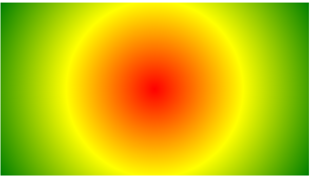
Equally Spaced Color Stops with a Radial Gradient (default)
An illustration of a radial gradient with uniformly spaced color stops may be found below:

Example
					#grad {
  background-image: radial-gradient(red, yellow, green);
}
Radial Gradient – Differently Spaced Color Stops
A radial gradient with differently spaced color stops is seen in the image below:

Example
					#grad {
  background-image: radial-gradient(red 5%, yellow 15%, green 60%);
}
Set Shape
The shape is specified by the shape argument. It accepts the ellipse or value circle. The ellipse value is the default.
An illustration of a radial gradient in the form of a circle is shown below:

Example
					#grad {
  background-image: radial-gradient(circle, red, yellow, green);
}
Use of Different Size Keywords
The size parameter defines the size of the gradient. It can take four values:
- closest-side
- farthest-side
- closest-corner
- farthest-corner
Example
A radial gradient with different size keywords:
					#grad1 {
  background-image: radial-gradient(closest-side at 60% 55%, red, yellow, black);
}

#grad2 {
  background-image: radial-gradient(farthest-side at 60% 55%, red, yellow, black);
}
Repeating a radial-gradient
Radial gradients can be repeated using the repeating-radial-gradient() function:

Example
A repeating radial gradient:
					#grad {
  background-image: repeating-radial-gradient(red, yellow 10%, green 15%);
}
