BS4 Containers
Containers
As you recall from the last chapter, in order for Bootstrap to surround the contents of a website, it needs a contained element.
Two container classes are provided, and containers are used to pad the material inside them:
- A responsive fixed width container is offered by the .container class.
- full width container that spans the whole width of the viewport is offered by the .container-fluid class.

Fixed Container
To make a fixed-width, responsive container, use the .container class.
Keep in mind that depending on the screen size, its width (max-width) will vary:
| Extra small <576px | Small ≥576px | Medium ≥768px | Large ≥992px | Extra large ≥1200px | |
|---|---|---|---|---|---|
| max-width | 100% | 540px | 720px | 960px | 1140px |
Resize the browser window when you open the example below to observe how the container width varies at various breakpoints:
Example
					<div class="container">
  <h1>My First Bootstrap Page</h1>
  <p>This is some text.</p>
</div>
Fluid Container
To build a full width container that always spans the full width of the screen (width is always 100%), use the .container-fluid class:
Example
					<div class="container-fluid">
  <h1>My First Bootstrap Page</h1>
  <p>This is some text.</p>
</div>
Container Padding
Containers are padded 15 pixels on the left and right by default, but not at the top or bottom. To make things seem even better, we therefore frequently employ spacing tools like additional padding and margins. .pt-3, for instance, indicates to “add a top padding of 16px”:
Example
<div class="container pt-3"></div>
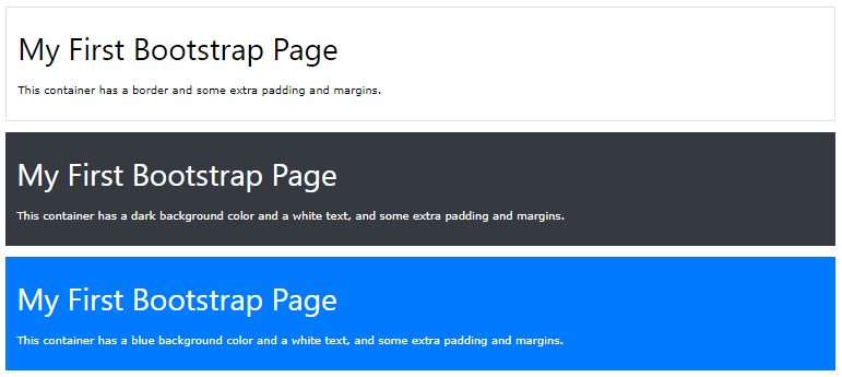
Container Border and Color
Alongside containers, other utilities like borders and colors are also frequently used:
Example

					<div class="container p-3 my-3 border"></div>

<div class="container p-3 my-3 bg-dark text-white"></div>

<div class="container p-3 my-3 bg-primary text-white"></div>
Responsive Containers
To create responsive containers, you can also utilize the .container-sm|md|lg|xl classes.
The max-width of the container will vary depending on the viewport and screen size:
| Class | Extra small <576px | Small ≥576px | Medium ≥768px | Large ≥992px | Extra large ≥1200px |
|---|---|---|---|---|---|
.container-sm | 100% | 540px | 720px | 960px | 1140px |
.container-md | 100% | 100% | 720px | 960px | 1140px |
.container-lg | 100% | 100% | 100% | 960px | 1140px |
.container-xl | 100% | 100% | 100% | 100% | 1140px |
Example
					<div class="container-sm">.container-sm</div>
<div class="container-md">.container-md</div>
<div class="container-lg">.container-lg</div>
<div class="container-xl">.container-xl</div>
