iOS: Tab Bar
In an iOS application, a TabBar is a control that shows and configures one or more bar button items in a tab bar for switching between various subtasks, views, or modes. The TabBarController and TabBarBar are used together to display the application’s tab list. Nonetheless, the application’s tab bar can function as a stand-alone control. The UITabBar class, which derives from UIView, is represented by the Tab Bar instance.
class UITabBar : UIView
The tab bar is constantly visible along the screen’s bottom edge. One or more UITabBarItem objects are contained in a UITabBar object. On the other hand, we can alter the Tab Bar’s appearance by altering its picture, background color, or tint color in accordance with the interface. An integrated UITabBar object that can be changed programmatically or using an interface builder is offered when we utilize the UITabBarController object.
The delegate object, which receives notifications on the addition, deletion, or rearranging of tab bar items, is linked to a UITabBar object. The collection of methods that are alerted when a user interacts with tab bar items is contained in the UITabBarDelegate protocol.
Configuring Tab Bar items
With the interface builder, we may customize the tab bar’s components. We may also configure them programmatically by using the UITabBar class’s methods and properties. The accompanying UITabBar is preloaded with a few tab bar elements when we add the UITabBarController object to the storyboard. But, in accordance with the specifications of the interface, we can add, remove, and rearrange objects.
A new item is automatically added to the tab bar associated with the tab bar controller when we add a new view controller to it and specify the relationship segue between them.
Interface Builder Attributes
| SN | Attribute | Description |
|---|---|---|
| 1 | Background | It represents the background image to display for the tab bar. The tab bar ignores the tint color information when we configure the background object. |
| 2 | Shadow | It represents the custom shadow image for the tab bar. This attribute cannot be set if the background image for the tab bar is not customized. |
| 3 | Selection | It represents the image to use for the selected tab. This attribute can be set programmatically using selectionIndicatorImage property. |
| 4 | Image Tint | It represents the tint color to apply to the selected item. This can be accessed programmatically using tintColor property. |
| 5 | Style | It represents the basic style that is applied to the bar. To set the style programmatically, we must use the barStyle property of UITabBar class. |
| 6 | Bar Tint | It represents the tint color to apply to the bar. We can use the barTintColor property to set this attribute programmatically. |
| 7 | Item Positioning | This represents the positioning scheme to apply to the item. This determines how the items are spaced across the bar length. |
Example
We’ll set up UITabBar’s look in this example. The tab bar controller won’t be used in this instance. Rather, we’ll enhance the current UIViewController with the tab bar.
Interface Builder
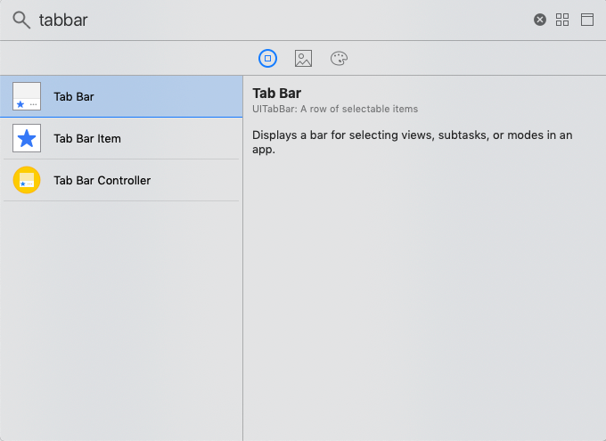
We need to add the UITabBar object to the view controller in order to configure the TabBar. To achieve this, look up TabBar in the object library and drag the result into the view controller storyboard that already exists.

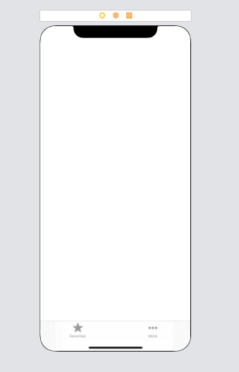
The view controller will get a tab bar as a result. Establish the tab bar’s bounds to ensure that it remains at the bottom of the screen. The storyboard will then resemble the picture below.

The object library allows us to add more tab bar elements to the tab bar. The ViewController.swift class will be assigned, and an outlet connection for UITabBar will be made within the class.
ViewController.swift
					import UIKit
class ViewController: UIViewController {
    @IBOutlet weak var tabBar: UITabBar!

    override func viewDidLoad() {
        super.viewDidLoad()
        // Do any additional setup after loading the view.
        tabBar.barStyle = .default
        tabBar.barTintColor = .white
        tabBar.backgroundColor = .blue

        tabBar.itemPositioning = .fill
        tabBar.tintColor = .blue
    }
}
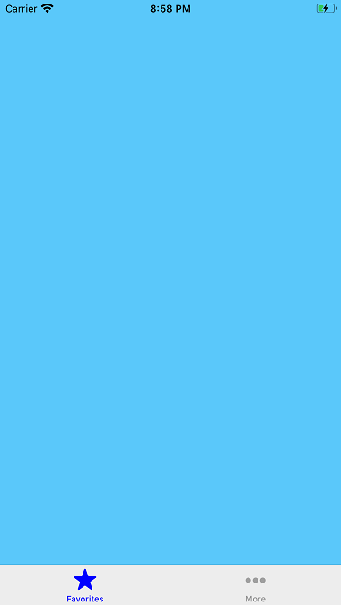
Output

