iOS: Tab Bar Item
Tab Bar Item
When a view controller is added to a tab bar controller, the tab bar item is the one that represents the view controller. It is a tab bar item that, when tapped, causes a new view to emerge above the tab bar. An instance of the UITabBarItem class, which derives from the UIBarItem class, is a tab bar item.
class UITabBarItem : UIBarItem
The tab bar interface makes use of a TabBarItem. When a tab bar is in radio mode, the user is unable to select two tab bar items at once. The features of the UITabBarItem class allow us to customize a tab bar item’s appearance. For an item that is utilized in practically all iOS applications, we may also provide the badge value. View Controller’s current status is indicated with some significant information via the badge value. For instance, a badge indicating the quantity of new messages received is displayed on the message tab in the Facebook application.
Now that the project is running, scrolling will be seamless because the images are being retrieved from the cache rather than downloaded during runtime.
Configuring TabBarItem appearance
Using the storyboard’s attribute inspector, we can alter a TabBarItem’s look. With storyboard, we can set up a TabBarItem’s characteristics as follows.
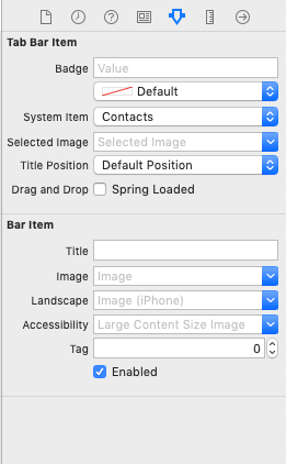
In this instance, we will set the look of a tab bar item that we made in TabBarController Example 1.
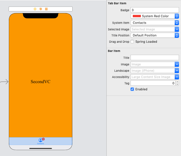
Let’s give the object a badge value, like in the picture below.
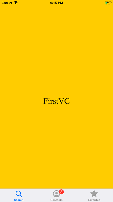
This application will produce the following output if we execute it.
To build a system item, we can use the init(tabBarSystemItem:tag:) method. Additionally, we can build a custom item with the given title and image—which is used as both the unselected and selected image—by using the init(title:image:tag:) method. To build a custom item with the given title, unselected image, and selected image, we use the init(title:image:selectedImage:) function.
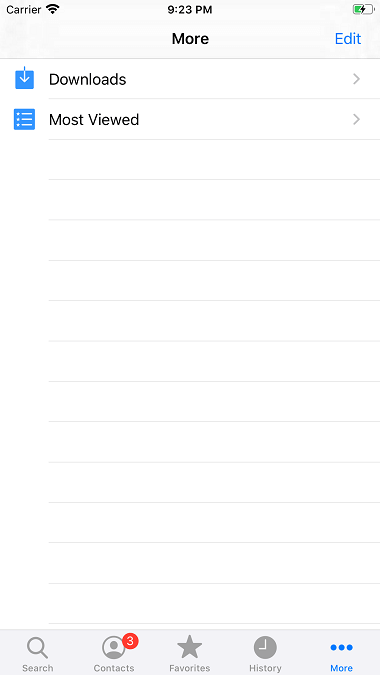
The More Navigation Controller
There is not much room in the TabBar connected to the TabBar Controller for the custom TabBar items to be shown. In the event that we add more than four things to a tab bar, the tab bar will only show the first four items in addition to the option to show the remaining items. A typical interface to choose the extra items is shown via the more item. Let’s examine the subsequent illustration.
Example
In the example above, let’s add three more view controllers and specify how the view controllers relate to the tab bar controller. This is how the interface builder will appear.
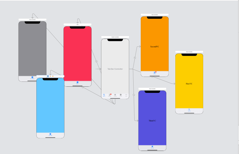
Run the project, please. This is what the output will look like.
